Let’s do a quick thought experiment. What comes to mind when you think of Amazon.com?
In addition to photos of things you secretly covet (smile), the logo of the online marketplace would also flash across. Though you may not recall the details of the logo (is the starting letter “a” in lower or uppercase?), you’ll remember it as a black and orange artwork with an arrow. And as long as it has some memorable quality, the company’s motive is satisfied. You see, organisations put in a lot of effort and spend tons of time and money in creating a recognisable brand.
Let’s extend this to Microsoft, the makers of the world’s most popular computer operating system. We all have seen the logo and kind of know what it looks like. It has four small colored squares. Right! But do you actually remember the sequence of colours?
Sponsored Links
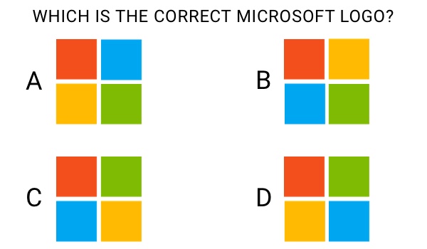
So which one is the correct Microsoft logo?
Answer at the end of the post!
The original WWW logo had three ‘W’s
Now think about the World Wide Web. What images come to mind?
Computers, browsers, web sites etc. But do you know that our beloved global network has a logo? And it’s almost as old as the web!
This is what it looks like:

What’s surprising is that even seasoned web developers do not know that the WWW has a logo!
Well, now you know better!
Who designed the logo?
The web was developed by Sir Tim Berners-Lee at CERN. This was a big undertaking and even though the title of the inventor of the World Wide Web has been bestowed upon him, it would be unwise to think that he was the sole creator. Berners-Lee received help from several people including colleagues at the high-energy physics institution.
One of them was Robert Cailliau, a Belgian engineer and computer scientist. In fact, Cailliau had been assisting Berners-Lee almost from the very start; in March of 1989, the two scientists had put forward an informal proposal to create an “Information mesh”. He also went on to co-developed the first web browser for the Macintosh – MacWWW (also called Samba).
Just before the First International Conference on the WWW (May 25-27, 1994), Cailliau came up with the simple logo with three overlapping ‘W‘s in white and green. The logo was displayed at the conference and each of the six inductees to the World Wide Web Hall of Fame was presented a Chromachron watch with the World Wide Web logo.
Why hasn’t the WWW logo become famous?
There are probably lots of reasons why the World Wide Web logo is not as well-known as Amazon’s or Microsoft’s. Here is what I think. However, remember I’m not brand marketer so take my comments with a pinch of salt. Would love to hear what you all think, though.
Firstly, the World Wide Web was made ‘free’ very soon after inception and became “enmeshed” (pun intended) with our lives fairly quickly. People simply accepted it’s presence. Secondly, quite like the Internet, the WWW it was never viewed as a product or a service. Thirdly, the logo was possibly never promoted aggressively.
Thus, the 3 ‘W’s logo simply feel behind and was replaced by generic ‘globe’ icons which have been overused. This is not to say that these clichéd graphics are a wrong representation of the global network. You see, people interpret the web in their own way – as a marketplace, information resource, networking etc. In my opinion, a globe icon isn’t all that bad… in fact, may be better suited!
Here is a screenshot of what I got in Google Images when I searched for “world wide web logo”. The original WWW logo does come up twice but the rest are globes!
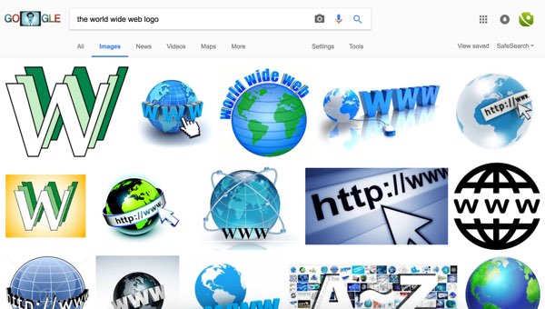
Do a search for “Amazon logo” or “Microsoft logo” and the majority of the results would be the actual logo of the company!
And finally, the correct Microsoft logo is C.


