If you’ve been using computers for some years, pre-LCD era, you’re probably aware of the famous 800×600 screen resolution. Once upon a time, this screen size was very popular with web designers. Special care was taken when creating web sites so that they displayed perfectly on monitors using this screen resolution – the web page width was 780 pixels (the 20 pixels were reserved for the web browser scroll bar).
However, over the years with increased use of high resolution monitors the number of people using 800×600 screen resolutions has gradually fallen. In this article we shall look at the usage statistics of 800×600 screen resolution for this web site and discuss whether it still is worth our while to design web sites based on it.
Sponsored Links
Important: Please understand that usage statistics shown on this page unless stated otherwise pertain only to the visitors who came to this web site. These numbers might not be applicable for your web site – in fact, they would most certainly be different. But they do show a trend which would be common around the world – the 800×600 resolution is slowly dying.
800×600 screen resolution usage is decreasing
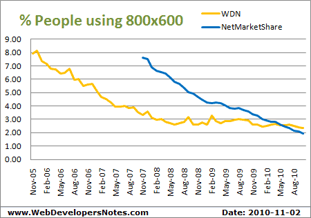
The graph above clearly shows that the usage of 800×600 screen resolution has declined over the years. However, if we check the numbers for the last year or so, it has reached a kind of plateau. Does this mean the old monitors are still in use? Probably… though it could also imply that people, especially those with visual impairment have set the screen resolution on their monitors to this value because it helps them in reading online text.
Though WebDevelopersNotes.com gets only about 3% visitors using 800×600 screen resolution, I don’t expect all other web sites to have the same stats because of different visitor profiles. This site caters to web developers, experienced and aspiring, and the probability of them using newer monitors or those with higher screen resolutions is definitely more.
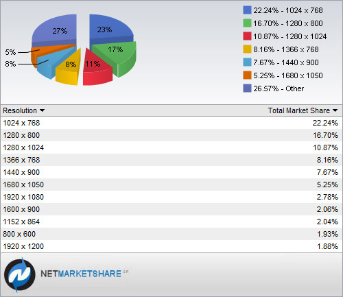
According to NetMarketShare, the global share of 800×600 screen resolution has fallen over the years. The most popular resolution is the 1024 x 768 – my personal favorite; I’ve used it for years till I shifted to my new laptop with 1280×800, which comes second.
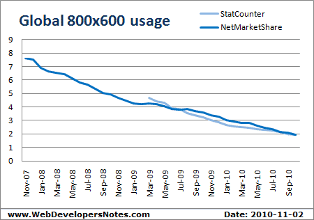
As evident from numbers from StatCounter and NetMarketShare the usage of 800×600 has been steadily decreasing. Below is a graph that illustrates the point that it might be time to give up designing for visitors using this screen resolution.
Should one keep designing web sites for 800×600?
It would be foolish of me to answer with a simple yes or no; I suggest you read more about this on the best width for web pages. Having said that, you can always have a liquid web design template where the width of the column that contains text is fixed. Most web designers are still creating fixed web page layouts with widths between 800 and 100 pixels. The right section of the web page which may be lost on 800×600 resolution (and can only be seen by scrolling horizontally), typically has advertisements or links to less important pages.
Update: September 2009
The 800×600 screen resolution just refuses to die. With 3% visitors to this web site (worldwide number will probably be more) employing it for their monitors, I suggest you look at the statistics for your web site to arrive at a decision.
Update: February 1, 2010
One of the visitors had an interesting observation. The persistence shown by 800×600 screen resolution may be because of the increased usage of netbooks.