Web page heatmap is a visual depiction of visitor activity, or in other words, the map is a graphical representation of how visitors behave on a web page. Heatmaps use different colors to chart this activity; for example, the red color denotes areas and sections of the highest visitor attention.
Such diagrammatical web page maps can be helpful in developing a web page layout or measuring the success of the present one. This is a boon for any one who runs a decently popular web site. “Enticing” elements can be placed at areas where the visitors are engaged.
Sponsored Links
One can potentially generate different types of web page heatmaps based on different visitor activity. For instance, visitor eye movements can be followed to know how they “read” a web page, or their mouse movements and clicks can be tracked to understand which sections of the page generate the maximum mouse activity. By the way, these two visitor activities – eye movement and mouse click tracking – might not translate into the same map.
Visitor eyetracking Heat maps on web pages
The most famous web page heat map is one involving the tracking of visitor eyes and gives an understanding of how they read a web page. Jakob Nielsen’s latest eyetracking report, details how 232 users read thousands of pages. The first outcome of the study is – visitors normally do not read by but scan the web pages. I guess you already knew this because you would be doing the same thing. Thorough reading of the entire page contents is rare and most visitors scan quickly trying to spot things that would interest them.
Another interesting result is the way web page is read (scanned) by the visitors. Nielsen calls it the “F-shaped pattern”. The ‘F’ shape is almost preserved (with minor variations) across different web page layouts and this is natural as most web site do conform to the standard layout of a two/three column design with the widest column containing the actual web page content.
Two other conclusions drawn by Nielsen have striking similarities with Search Engine Optimization (SEO). Following the ‘F’ shaped pattern on the heat maps, he recommends putting the most important content in the first two paragraphs and starting subheadings, paragraphs and bullet points with information carrying words. As any web developer would know this is not unlike basic SEO practices wherein one needs to put the keywords near the beginning of the page contents and in subheads.
Another famous eyetracking study was done by Poynter Institute in collaboration with Stanford University (who developed the sophisticated software for the project). The result of the study can be found on the Stanford-Poynter Project web site. The research is quite exhaustive and available online though they can make it a little easy to navigate. Any way, the key inferences drawn are that most visitors start reading a web page from the top left corner (assuming that the web page is in a language that’s written left to right). The eyes then shift focus to other sections of the web page (headlines do get the attention they deserve) and finally come to rest somewhere on the right quadrant of the web page.
Heatmap colors – visualization of your webpage
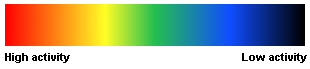
Web page visualization based on heatmap colors can provide interesting insights. Typically, web page heatmaps have of red, orange, green and blue in different shades. Generally the red color denotes areas of maximum activity followed by orange, greens and blues. Sections that show negligible or no activity come out in black.
Eyetracking heatmap of a Google results page with a column of PPC ads on the right shows maximum activity or eye fixations on the first 5 links gradually fading off to the other results. This was expected as only these links were displayed above the fold (for the other results one needed to scroll down). Thus, the first 5 links are overlaid by red, orange and yellow colors of the heatmap. The first 3 PPC ads also elicited some attention from the visitors. Other interesting aspect was that even though some visitors did scroll below to have a look at other results (shades of the blue color) negligible visitors looked at ads displayed on the right below the fold. It was clear that a reasonable number of searchers will look at the ads as long as they are above the fold.