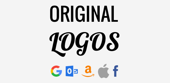
A logo is the identity of a company. This small graphic typically embodies what the company stands for or what it wants to achieve. It’s, after all, the “image” of the company. But logos, just like other things in this world, undergo changes.
A few company logos have remained the same, or almost the same, over decades – Coca-Cola comes to mind. However, in case of others, changes in design concepts and/or the evolution of the company’s core ideals have lead to a complete overhaul. With the new “in-tune” image, little remains of the original logo.
Sponsored Links
Image Source: By Coca-Cola Company – Scanned by uploader from Wired magazine (Nov 2010), Vol. 18, No. 11, p. 104., Public Domain, https://commons.wikimedia.org/w/index.php?curid=12726582
Here are few original logos of famous companies and web services.
Apple
The first Apple logo was designed by the third founder of the company, Ronald Wayne. Yes, the same one who sold his 10% stock in the company for $800 after just two weeks of incorporation.
![]()
Image Source: By Unknown – Transferred from en.wikipedia to Commons by Sreejithk2000 using CommonsHelper., Public Domain, https://commons.wikimedia.org/w/index.php?curid=10503104
The woodcut logo had Sir Isaac Newton sitting under an apple tree (probably) reading a book. The apple fruit in the tree was highlighted and a quote by William Wordsworth – “A mind forever Voyaging through strange seas of Thought, alone.” – ran around the graphic.
![]()
Image Source: By Rob Janoff – This vector image was created by converting the Encapsulated PostScript file available at Brands of the World. Remember not all content there is in general free, see Commons:Fair use for more.This tag does not indicate the copyright status of the attached work. A normal copyright tag is still required. See Commons:Licensing for more information., Public Domain, https://commons.wikimedia.org/w/index.php?curid=10326626
As you can understand, the original logo was complex and was quickly replaced with the “rainbow Apple” designed by Rob Janoff. The new logo was multicoloured apple with a bite taken our to it. The bite was to avoid confusing the fruit with a cherry while the 6 colours were employed to “humanise” the electronic company as well as represent the color graphic capabilities of the Apple II.
Hotmail
![]()
As per Sabeer Bhatia, the co-founder of Hotmail, the name was chosen because it had the alphabet H, T, M and L in that order. This was a hat tip to HTML, HyperText Markup Language. And in the original logo, these four alphabet were capitalised.
Facebook was started in the dormitory of Harvard University by Mark Zuckerberg and others. It was named after the directories distributed at American colleges and universities that carries pictures and brief bios of students.
The service was originally called TheFacebook and ran on the domain name thefacebook.com. Only later, in 2005, was the shorter facebook.com domain name purchased for $200,000 from AboutFace Corporation.
![]()
The original logo of the service had the face of Al Pacino (yes, the famous actor) on the left. The pic probably was from the 1983 hit movie Scarface. However, according to some, it was the face The J. Geils Band’s lead singer Peter Wolf. Considering it was a started by a bunch of young students with little experience in design, the original logo wasn’t that bad!
Amazon.com
The largest market place in the world was incorporated as Cadabra (from Abracadabra) by Jeff Bezos on 5th July 1994. When he realised that it sounded like ‘cadaver’, he changed the company name to Amazon, after the South American river.
And as per Bezos, the word ‘amazon’ began with the first letter of the alphabet which meant it would be placed near the top on web indexes (which were in alphabetical order). Also it had both the first letter and the last letter of the alphabet.
![]()
Amazon’s original logo had the river shaped into the letter ‘A’ and this can be seen in the invoice of the first product sold from the web site. The ‘smile’ logo which we are now all familiar with was designed by Turner Duckworth. The ‘smile’ is also an arrow pointing from letter ‘A’ to ‘Z’ signifying that the market place carries everything from a to z. Bezos showed his love for the logo by saying “Anyone who doesn’t like this logo doesn’t like puppies“.
At one point, the smile/arrow was animated but this was quickly removed because of it being misinterpreted as a phallic symbol.
No logo list would be complete without mentioning Google, the world’s favourite search engine. Why? Because the company frequently replaces their logo with a doodle – called the Google Doodle.
![]()
These came about when the founders, Larry Page and Sergey Brin, had taken short leave to attend the Burning Man festival and and replaced the logo with one featuring it.
Anyway, Google’s original logo was quite plain with the letters in primary colors. The logo colors were possibly inspired from the colors of the building blocks (Duplo?) Larry Page used to house the 10 4GB hard drives that ran the search engine.
![]()
Image Source: By Source, Fair use, https://en.wikipedia.org/w/index.php?curid=17494117
Let me end this post with one of my favourite logos – Sun Microsystems. I love the way the ‘S’, ‘U’ and ‘N’ make up ‘SUN’ from four different directions.
Let us know what you think of this list. And have a blessed day!