We come across text at various places – in the newspaper, television, billboards, web sites etc. And these different bits of text are displayed in different styles and colors. The aim of the designer is to attract your attention and keep you captivated. In addition to layout, designers lay special emphasis on the font selection. This, as you can understand, is extremely important. For instance, a font used in headline text will be illegible at small sizes.
Typographers are people who design typefaces (or fonts, if you like). Before the advent of digital technology, creating a typeface was a painstaking and time-consuming process. The typefaces would become the designer’s babies. No surprises then, that the names of several typefaces were derived from the names of the designers – Baskerville, Gill Sans and many more.
Sponsored Links
However, occasionally, type designers extended their creativity to font names. Here are a few that we came across.
Times New Roman
Image Source: Pixbay
Stanley Morison, a British typographer, was critical of the font employed by The Times UK. Instead of taking offence, the newspaper commissioned him to design a new typeface for them. Morison seized the opportunity and, with Victor Lardent, and in 1932, came up with Times New Roman. The publication ended up using it for 40 years straight!
Helvetica
Image Source: Pixabay
Designed in 1975 by Max Miedinger, the original name of this typeface was Neue Haas Grotesk. It was later changed to Helvetica, the Latin adjective for Switzerland.
Arial

Image Source: By Joe Parks from Berkeley, CA – Saguaro National Park, CC BY 2.0, https://commons.wikimedia.org/w/index.php?curid=26554122
Helvetica needs to be followed up with Arial. You see, the widths of the characters in the two fonts are exactly the same!
And was done intentionally by the designers of Arial! The typeface was created in 1982 by a 10-member team led by Robin Nicholas and Patricia Saunders at Monotype Typography because they didn’t want to pay the license for Helvetica. Since the two fonts are metrically the same, a document in Helvetica can be converted to one in Arial without any changes in layout.
IBM realised this and contacted Monotype for Arial. The typeface was to be used on their 240-DPI 3800-3 laserxerographic printer. When Arial was delivered, the name was changed to Sonoran Sans Serif because of license restrictions. The name comes from the Sonoran Desert in Tucson, Arizona where IBM’s manufacturing facility was located.
Courier
Image Source: By Etan J. Tal – Own work, CC BY 3.0, https://commons.wikimedia.org/w/index.php?curid=8453480
In the mid-1950s, IBM commissioned Howard Kettler to design a typeface for a new line of electronic typewriters they were developing. The company wanted the characters of the typeface to look similar to ones printed by a strike-on typewriter. The monospaced Courier font was delivered to IBM in 1955. It was used in their highly successful range of typewriters introduced in 1961 – IBM Selectric.
When it was being designed, the typeface was called Messenger. The name was changed to Courier at the last minute by Howard Kettler. The designer later commented that the new name conveyed “dignity, prestige, and stability”.
The popularity of Courier stems from the fact that it is royalty free! It is the industry standard for screenplays, and, till 2004, was the standard typeface of the U. S. State Department. The font cannot be trademarked or copyrighted.
Verdana

Image Source: Pixabay
Virginia Howlett was one of the first designers hired by Microsoft. In addition to setting up the first user interface design team at the company, she played a pivotal role in designing the Windows 95 3D graphic interface and starting the company’s corporate art collection.
At that time (and even now), Microsoft’s Windows was the reigning operating system in the world. The company realised the importance of having a font which would make text, even when displayed in small sizes, easy to read on the computer screen. In 1996, the company commissioned Matthew Carter, a British type designer. Howlett chipped in with her inputs and Verdana was born!
The name of the font is a combination of ‘verdant‘ which means green and ‘Ana‘, the name of Howlett’s eldest daughter!
Georgia
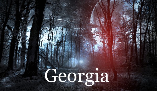
Image Source: Pixabay
Designed by Matthew Carter, the name of Georgia font comes from a tabloid headline – “Alien heads found in Georgia“. The serifed font has characters with relatively large x-heights which probably makes them easy to read on computer screens.
Tahoma
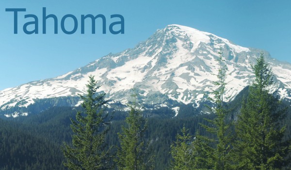
Image Source: By User:Deathgleaner, stitched by User:Richardprins, Retouched by User:Mmxx – User:Deathgleaner, Image:Mount Rainier panorama.jpg, Public Domain, https://commons.wikimedia.org/w/index.php?curid=5192579
Besides Verdana and Georgia, Matthew Carter made several fonts for Microsoft. A popular one is Tahoma whose name comes from the Native-American name for Mount Rainier.
In fact, as per The New Yorker, the famed British type designer is “the most widely read man in the world” based on the number of commonly used fonts he has designed for the world’s most dominant operating system.
Trebuchet MS
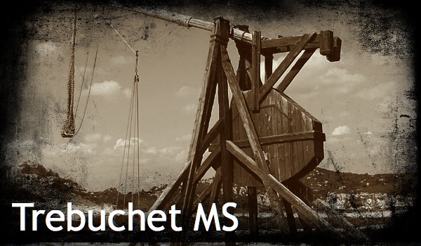
Image Source: By No machine-readable author provided. Quistnix assumed (based on copyright claims). – No machine-readable source provided. Own work assumed (based on copyright claims)., CC BY-SA 3.0, https://commons.wikimedia.org/w/index.php?curid=36162
Vincent Connare has designed and/or contributed to many fonts we find on the Windows operating system. One of them stands apart – MS Comic Sans. As per Connare, the inspiration for the font came from The Dark Knight and Watchmen comics he had in his office.
Anyway, I digress, this is about Trebuchet MS. The font was named after a medieval siege engine.
Perpetua
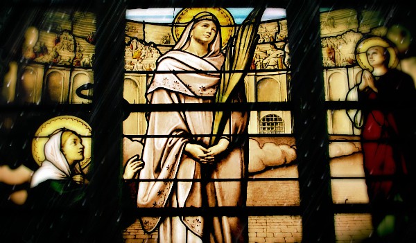
Image Source: By Gaetan Poix – Own work, CC BY 3.0, https://commons.wikimedia.org/w/index.php?curid=4634107
The typeface was commissioned by Stanley Morison (of Times New Roman fame) and designed Eric Gill (of Gill Sans fame) for the British Monotype Corporation. It’s name comes from the Christian martyr Vibia Perpetua. The italic form of the typeface is named Felicity after Perpetua’s companion Felicity, who too was martyred.
Hope you liked the stories behind the names of these fonts. Please do leave a comment below to let us know what you think.